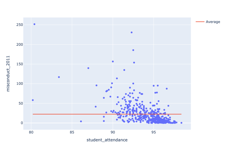
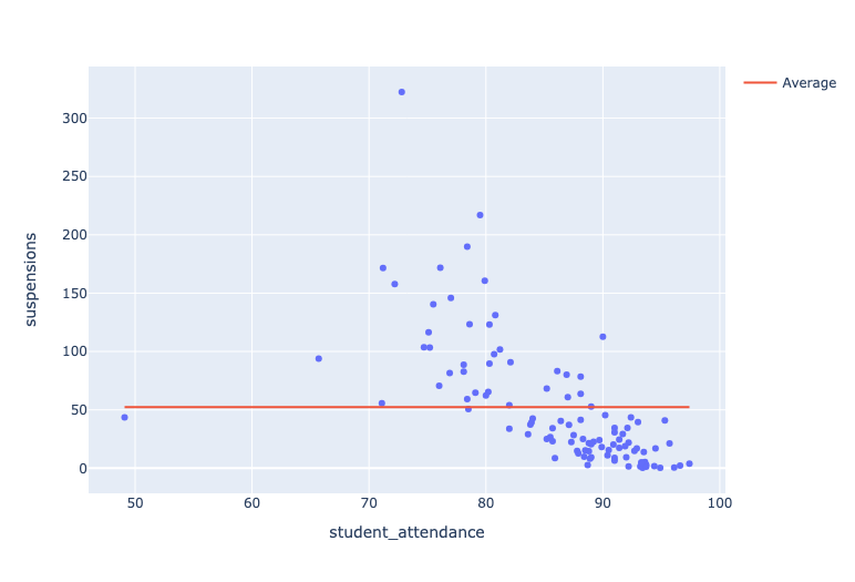
Misconducts by Grade Level


For the first graph, we used the 2011 data and focused on elementary and middle schools. For the second graph, we focused on high schools, using the 2013 data set, and applied suspensions as a substitute for misconduct. Our first insight was that the relationship between student attendance and misconducts was negative for high levels of attendance. For this first graph, there is a key grouping of schools in the bottom right of the graph with levels of misconduct below the average along with the highest levels of attendance; however, this negative relationship doesn't hold for schools with attendance levels between 90 and 95 as the points become much more randomly dispersed within this interval, suggesting that student attendance is only a solid indicator of misconduct at high levels. Our second insight related to the suspension graph, which displays a strong negative relationship between attendance and suspensions. As the number of students attending class increases, the number of suspensions drop substantially for these schools. Since the first graph dealt with elementary and middle schools and the second focuses on high school, our third insight was that student attendance is a much stronger indicator of misconduct levels for high school students than for elementary and middle schoolers. This can be seen in the strong negative relationship between the two variables in our second graph.
Graduation Rate and Location
In this visualization, we focus on rates of suspension and how they affect the graduation rates, which are indicated by the size of the points. We also color-coded the suspension levels to make the graph more clear. Green represents schools in the lowest 25% group ordered by suspensions per 100 students. Blue represents those in the middle 50%. Red represents schools in the highest 25% group. One insight that we have from the data is that schools with lower levels of suspension tend to have higher graduation rates. This can be seen in the graph as the schools with lower levels of suspension (green and blue) have larger points on the map than those with a higher level of suspensions (red). Another insight from this graph is that schools that are North of Chicago's center tend to have higher graduation rates and lower levels of suspension. In fact, a majority of the schools with the highest levels of suspensions are South of the city, which indicates that location of the school may be an important factor on both graduation rates and suspension rates. A third insight that we noticed was that many schools moved from the higher group in terms of suspensions to the middle grouping in 2013. This shows that suspension levels went down for these schools between 2012 and 2013 and came closer to the mean. This may be a sign of time being a factor in suspension rates, but a lack of data past 2013 or before 2012 makes this inconclusive.